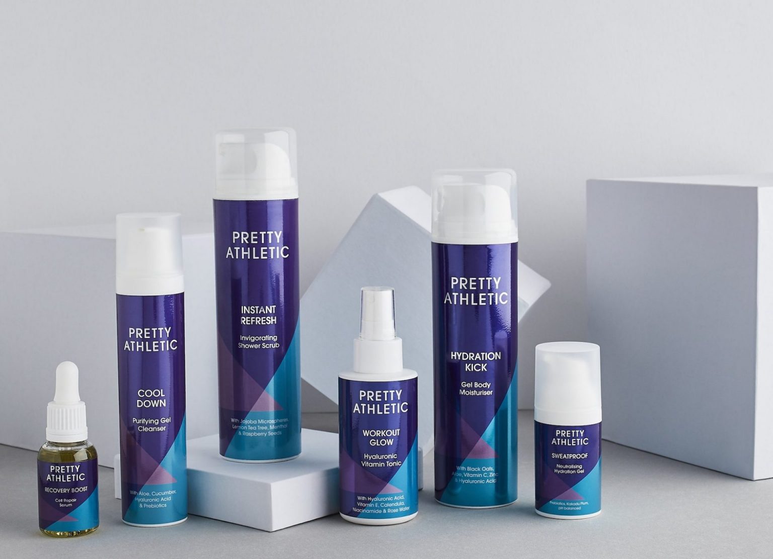
Part of what makes us tick is collaboration with brands both big and small. That’s why when Pretty Athletic approached us to assist from concept to execution, we couldn’t be more excited to bring their brand to life.
Their big idea? “The UK’s first skincare brand uniquely designed and developed exclusively for active women.”
Our experienced design and marketing team worked with Pretty Athletic right from the brand’s ideation phase, through to the execution of suitable print options. Through a series of workshops, we co-created a striking design ready to launch this new brand into the world.
Once signed off, the printing work began. This involved creating metallic effect labels for their first eight skincare products in order for them to not only launch, but also catch the eye of major retailers. Aesthetics aside, the labels would need to meet stringent specifications to wow prospective retail brands and customers alike.
However, as with any small startup projects, cost efficiency was a major consideration too – so discussing the cost implications of each metallic effect was crucial in ensuring a feasible long term outcome. As such, our team set to work costing out flexo metallic inks, metallic foils and the use of metallic substrates. Print runs were small initially, with the option to scale quickly as demand grew for the product.
We were able to deliver a premium, high quality metallic print result by using digital printing and save a considerable amount compared to flexo or hot foiling options. Furthermore, due to the longer term ambition of a more extensive range of skin care products, digital printing would allow for the most flexibility to test more new products in the market while limiting costly set up fees.
Our Xeikon CX3 digital press made it easy and cost effective for us to offer several sets of proofs in a selection of colour ways so that the client could select the one best suited to their brand.
Through extensive prototyping, we were able to ensure peace of mind for our client while creating samples for them to stress-test with retailers. The finished product could be tweaked and adjusted to ensure both the client and the retailers had ample chance to give feedback and suggestions.
The use of Xeikon white toner in key areas on the design with print directly onto the silver metallic substrate in others achieved a high quality result while avoiding the need for expensive plates and setup.
But don’t just take it from us! Hear our client’s testimonial below. Our client Leyla says “I contacted PeterLynn along with two other label manufacturers, but it was clear from day one that the team at PeterLynn understood my brief and were willing to pull out all the stops to meet our requirements and deadlines.”
“It was Vicky who suggested the use of silver PP instead of multiple foils or inks and plates and once she showed me the effect on the early press proofs, I knew this was the best way to represent my brand. I love the labels; they are so eye-catching and have proved a hit at both Waitrose and Holland & Barrett who now both stock our skincare range.”
We look forward to supporting your business in whatever stage it is in – from fledgling brand to a booming powerhouse. Our collaborative approach means that while you can share your business expertise with us, we can share our printing knowledge with you! And so, unstoppable brands are created. We hope our Pretty Athletic case study inspires you to take action on your big idea – and here’s hoping we can make magic happen together.
Contact us today to find out more.

